You walk into a doctor’s office with sharp stomach pain. You describe your symptoms in great detail, outlining all the issues and how they’re impacting you. The doctor patiently listens, then says, “I have just the thing. BRB.” After a few moments, the doc returns and hands you a little bottle. “Try this,” they say. “It works for most people.” You look at the bottle, and it’s a basic, over the counter pain killer.
You leave with that bottle and a weird feeling in your gut (both literal and metaphorical). Sure, this might dull the pain, but does it really solve it? What if the real issue isn’t temporary? Or it’s something deeper that needs more than a brief description to understand?
But it gets worse. No matter how many times you go back to that doctor, you keep getting the same bottle handed to you.
Or, you might have the other extreme: you visit a doctor for a mild rash. You’re not sure what’s going on. So you see your doctor and they say, “Well, we can cut it off.” Cut it off? Does it need to be cut off? That’s serious business! And, when you visit them next because your head cold isn’t going away, they recommend the same treatment plan: “Let’s just cut that part of your face and head off.”
I’d bet you won’t keep going back to that doctor.

This example is incredibly extreme. It’s absurd. But, I wanted to get the point across because we see similar absurdities all the time in the world of digital experience design.
A team spots a problem—conversion drop, user confusion, customer dissatisfaction—and designers will reach for their favorite tool to diagnose and solve the problem. It feels like progress. But it’s often a poor fit for the kind of problem they’re dealing with. Sure, we have our fancy problem statement, but we haven’t understood the type of problem it is. We understand the symptoms. Now we need a diagnosis.
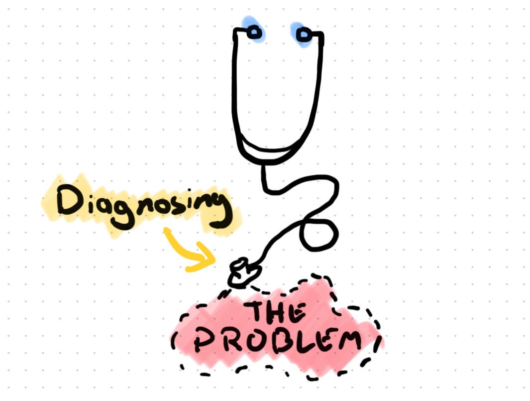
That’s why I keep coming back to time-tested Elements of User Experience by Jesse James Garrett . They’re fantastic as definitions. But they also work as a great diagnostic framework. It helps us figure out where a UX problem actually lives, so we can apply the right methods, the right tools, and the best match of design artifacts to focus on.
Why We Default to Tools, Not Diagnosis
As designers, we love to do. Give us a problem and we want to open Figma and build a prototype. Making things feels good. It feels productive. And feeling productive is what we often thrive on.
But just because we’re producing artifacts doesn’t mean we’re understanding the right problem and problem type to solve.
Over the years, we’ve developed our favorite tools, the ones we are comfortable with, the ones we keep as our “secret weapon”. Too often, when we’re faced with a problem, our reflex is to grab for that favorite tool that we know and love…usually one tied to the skeleton or surface or some other layer of the user experience. Then, without checking to see if it fits the problem, we plow ahead and wind up spinning our wheels at some point. The hammer might be shiny, but that doesn’t make it the right tool for driving a screw.

That’s why we need to slow down and diagnose the type of problem we’re dealing with. Take that problem statement and understand the context and what’s really behind it. Garrett’s layered model gives us a clear frame for our problems.
The Five Layers, Reframed for Diagnosis
Think of the five layers (strategy, scope, structure, skeleton, surface) as a kind of UX diagnosis tool. They give you criteria to examine the experience and identify where things might be breaking down. And once you know the type of problem, you can decide which tools, artifacts, and processes are appropriate.
Each layer comes with its own symptoms, signals, and tools. Let’s take a quick peek:

Strategy Layer
This is the foundation of everything. This is where you find the value match between what the business offers and the users want. The product exists because there should be a mutually beneficial relationship between these two.
Symptoms
- You’re launching a new product and can’t seem to gain a profitable user base.
- Your product has seen subscriptions declining steadily for the past 2 years.
Ask Yourself
- Does the value of the product fit the market you’re going after?
- Is your pricing model sustainable?
- Has our market shifted?
- What data do we have on our user and market needs?
Tools
- Jobs-to-be-Done
- Business Model Canvas
- Value Proposition Canvas
If this layer isn’t formed, clear, and communicated, everything above it will fail. Period. Overlook this layer to the peril of your product or project.
Scope Layer
This is where your strategy becomes a plan. It’s about defining what the product should do. And, just as importantly, what it shouldn’t. This is where your value becomes defined as concrete features and functions that a user can interact with.
Symptoms
- Unclear requirements that shift constantly
- Pressure to design before understanding what you’re building
- Teams building features that don’t ladder up to user or business goals
- Stakeholders asking “Can we also add…” without understanding tradeoffs
- Features that are disconnected and don’t compound value to the user.
Ask Yourself
- What are the boundaries of this experience? Are we solving the right parts of the problem?
- What specific capabilities does this product need to deliver on our strategy?
- What are we explicitly NOT building, and why?
- How do these features connect to create a cohesive experience?
Tools
- Journey maps
- Service blueprints
- Object-oriented UX (OOUX) mapping
- User story mapping
- Competitive analysis
Many teams try to structure flows without having clarified the scope. That’s like laying out floor plans without knowing how many rooms you need. If you find yourself constantly redesigning the same screens or if stakeholders keep asking for “one more feature,” you’re probably dealing with a scope problem, not a design execution problem. Get clear on what you’re building before you figure out how to build it.
Structure Layer
This is where we define how users move through the experience. It’s the bones of the navigation, flow, and logical relationships. This layer encompasses both information architecture (how content and features are organized) and interaction design (how users move between and within those organized spaces).
Symptoms
- Users drop off mid-flow or abandon tasks partway through.
- High bounce rates on key pages or screens.
- Users taking unexpected paths through your product.
- Complaints about not being able to find things.
- Analytics showing users repeatedly visiting the same pages without progressing.
- Support tickets asking “How do I…” for basic tasks.
Ask Yourself
- Does the experience have a clear and usable shape?
- Can users predict where actions will take them?
- Are we organizing information in a way that matches user expectations?
- Do the interaction patterns feel consistent and predictable?
- Are we asking users to make decisions without enough context?
Tools
- Information architecture diagrams including site maps and navigation models.
- Content modeling and taxonomy work.
- Wireflows that show both layout and flow.
- Task flows and user flows.
- Process flows for complex multi-step interactions.
If you’re getting feedback like “I didn’t know where to go next” or “I can never find what I’m looking for,” this is the layer to investigate. Many teams jump straight to redesigning interfaces when the real issue is that the underlying structure doesn’t make sense to users. You can move information around if you redesign enough screens, but it’s far more efficient to fix the arrangement of the bones before you worry about the skin.
Skeleton Layer
There is where we finally enter layout, interface patterns, and interaction design at the screen and component level. This is the layer where you start creating pictures of what a user might see. It’s visual and functional. It’s the arrangement of elements and the specific ways users interact with them.
Symptoms
- Users can complete tasks, but it takes longer than expected.
- High abandonment rates in workflows or tasks.
- Users frequently click the wrong buttons or controls.
- Users miss important information that’s technically “on the page.”
- Complaints about interfaces feeling cluttered or overwhelming.
- Inconsistent interaction patterns across similar functions.
- Users struggle with form completion or data entry tasks.
Ask Yourself
- Does the user flow have a smooth progression?
- Is this screen structured in a way that supports the task efficiently?
- Are the most important actions and information prominent?
- Do interactive elements look and behave consistently?
- Are we following established interaction patterns users expect?
- Is the layout optimized for the user’s context and device?
Tools
- User flow diagrams based on service blueprints and user journeys.
- Wireframes and low-fidelity prototypes.
- Heuristic evaluations and expert reviews.
- Component libraries and design systems.
- Usability testing focused on task completion.
- Click tracking and heat map analysis.
- A/B testing of layout variations.
If the flow makes sense but users stumble on individual screens or interactions, you’re dealing with skeleton issues. This layer is about making the good structure you’ve built usable and efficient. Users should easily progress through steps in a flow. They shouldn’t have to think hard about how to use your interface. It should feel obvious.
Surface Layer
This is the final coat of paint. It’s the veneer that people perceive on top of everything else we’ve explored so far. This is the visual design, typography, color, imagery, and aesthetic polish that users actually see and touch. This is where usability is optimized, and your brand can visually resonate with your audience. But don’t mistake “final” for “least important”. Surface problems can destroy trust and credibility instantly. Likewise, this final layer has nothing to stand on if the previous layers aren’t solid.
Symptoms
- Users express lack of trust or credibility concerns.
- Brand recognition problems or misalignment with company identity.
- Accessibility complaints about contrast, readability, or visual clarity.
- Users perceive the product as outdated, unprofessional, or “cheap”.
- Users miss important information due to poor visual emphasis.
- Different emotional response than intended.
Ask Yourself
- Does this look and feel professional and trustworthy?
- Is our brand clearly represented?
- Are we meeting WCAG standards for visual elements?
- Does the visual hierarchy support the functional hierarchy?
- Are we fostering the right emotional response?
- Is the aesthetic appropriate for our users and context?
Tools
- Visual frameworks like PARC, gestalt principles, and color theory.
- Brand guidelines and visual identity frameworks.
- Design systems and style guides.
- Illustration libraries and micro-animations.
- Accessibility audits for visual elements.
- First impression testing and aesthetic usability studies.
Surface layer problems are real UX problems, not just “making things pretty.” But they aren’t the only UX problems. They’re the ones that we “see” most easily. When users don’t trust your product because it looks unprofessional, or when they can’t read your text because of poor contrast, that’s a user experience failure. The key is making sure you’re actually solving surface problems, not using surface solutions for deeper structural issues.
Some Practical Examples
Let’s look at some hypothetical scenarios and apply some diagnosis questions based on the layers:
- “Our checkout abandonment rate is terrible.” → This might sound like a surface problem, but dig a little deeper. Is the checkout process asking for too much information too early (scope)? Are users getting lost in a confusing multi-step flow (structure)? Or are your product costs so high that no amount of pretty buttons will help (strategy)?
- “Adoption for our new feature is extremely low. Let’s add more tooltips and help text.” → Feels like a skeleton problem, more guidance should help, right? But if users fundamentally don’t value the feature, you’ve got a scope problem. No amount of visual polish will compel them to use it.
- “Designers want to rebuild the entire app because it looks old.” → This opinion-based diagnosis is focused on the surface. But if your data shows declining user engagement, ask whether the underlying product strategy still matches market needs. Sometimes “it looks old” is really “it doesn’t meet the needs anymore.” Both may be needed, but don’t confuse value for a brand problem. They are different levels of problems to solve for.
- “Our onboarding completion rate dropped after we added that new step.” → Teams often jump to structure solutions, “Let’s optimize the flow!” But maybe you’re asking users to do something that doesn’t align with their goals at that moment (scope issue), or maybe the step feels pointless because it doesn’t provide any value to users (strategy problem).
When teams misdiagnose, they often end up wasting time on inefficient methods of problem-solving. You may still arrive at a solution, but in a roundabout way. Applying surface and skeleton solutions to strategy and scope problems means a lot of extra work. You ship one or two changes, but symptoms keep coming back because you’re treating the wrong layer.
Becoming a Better UX Doctor
Remember that doctor? The one handing out generic pain killers for every ailment, or recommending surgery for a simple rash? Simply treating the surface of the presented problem? Yeah, I wouldn’t go to them after the 2nd or 3rd visit once I realized what was going on.
The best doctors don’t immediately reach for their favorite prescription. They spend time gathering data and creating a diagnosis first. They ask questions, run tests, and understand the root cause before recommending treatment. They know that the same symptom (like a headache) could be caused by a variety of issues. The treatment depends entirely on the diagnosis. The diagnosis depends entirely on data available to inform the diagnosis. A proper diagnosis leads to proper treatment.
As UX professionals, we need to be more like good doctors. When someone comes to us with “users are confused” or “conversion is low,” our first instinct shouldn’t be to grab our favorite “design treatment”. We should ask: I wonder what layers this problem lives in?
Since users perceive everything through the surface layer, it takes some time and analysis to get the diagnosis right. Garrett’s five layers give us a great framework to slow down, investigate, and prescribe the right treatment. Sometimes that treatment is a comprehensive strategy refresh. Sometimes it’s a simple interface tweak. The magic is in knowing the difference.
Because the last thing we want is UX malpractice. The one who keeps prescribing the same solution regardless of the actual problem. Your users (and your stakeholders) deserve better diagnosis than that…whether they follow it or not.