There’s a gear culture that’s pretty popular with the outdoors or rugged community. It’s called “Every Day Carry” (EDC). These are the things they carry in their pockets or on their belt almost every day. They are useful items or tools that make life easier. Some (like me) carry tactical pens, some carry a thin rigid wallet, others carry a pocket knife or Leatherman, still others carry a host of other stuff. The idea is to have a set of helpful tools to help you deal with whatever comes your way.
In the world of digital experience design, there are a handful of tools that help designers in sticky situations. Whenever you need a solid reasoning as stakeholders challenge your work. Or you need to speak confidently to senior leaders without sounding like you’re making stuff up. Or when you get promoted and need to help guide others through their own thinking. You need a toolkit. Specifically, you need time-tested frameworks you can carry in your back pocket to help make the world make sense.
Most designers think great design comes from intuition, emotion, or “the muse”. They believe successful designers just ride on good vibes to arrive groundbreaking solutions. While intuition and feeling play a part, you need to back that intuition up with concrete reasoning. Why? Because, I believe what we call intuition is often just pattern recognition we can't explain. We see things that work, but we don't comprehend why they work. And when someone challenges our choices, we're left stammering about “users liking it“ or "best practices" while everyone else rolls their eyes.
If you want to advance in your career and avoid the mid-career plateau, you need to keep a strong design EDC. You need to move from flying by the seat of your pants to solid reasoning frameworks. From emotional hunches to well reasoned rationale.
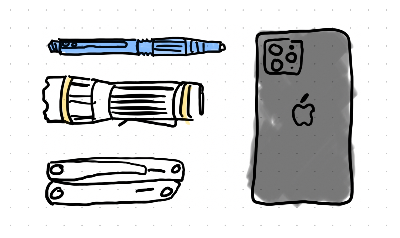
Curate Your Design EDC
In the Every Day Carry community, people obsess over the tools they carry daily. Every item earns its place by proving useful in real situations. If something hasn't been needed in weeks, it gets dropped. It's about curation through practical, proven use…not through hopes and good feelings.
Your design career works the same way. The design tools you use should be time-tested and proven. The design tools you carry determine whether you can handle whatever gets thrown at you without floundering. The right ones help you diagnose problems accurately, explain and defend decisions confidently, and speak the language that gets you taken seriously. These aren't frameworks you pull out for special occasions. They're the ones you reach for instinctively when problems arise. You keep them sharp, clean, and at the ready.
Most designers are walking around with the equivalent of a plastic spork when they could be carrying professional-grade tools. Let's fix that.
Here are the five frameworks that belong in every serious designer's EDC. These aren't theoretical concepts I think you should know. They're the practical tools I reach for daily, proven through years of design challenges that would have otherwise left me looking foolish in meetings.
1. The Elements of UX: Your UX Recipe Book
What it is: 20 years ago, Jesse James Garrett developed a five-layer model that breaks user experiences into strategy, scope, structure, skeleton, and surface. It’s a holistic way of looking at what it takes to create user experience. Each layer interacts with and depends on the other four layers.

How It Helps: Most design problems get misdiagnosed. Stakeholders see a confusing interface and immediately want a quick fix (surface fix). But a fresh coat of paint won't fix a structural problem any more than new flooring fixes a cracked foundation.
Example Scenario: Maya gets pulled into an emergency meeting. "Users hate our checkout flow," announces the product manager. "Can you make it more intuitive?" Everyone's looking at Maya expecting her to promise prettier buttons and clearer copy.
But Maya is prepared. She pulls out her layers framework and starts with an analysis of the flow and UI layout. She wonders whether users are abandoning because they don't understand the interface, or because we're asking for too much information too early? Are they confused about where they are in the process, or do they fundamentally not see the value in completing checkout?
Maya spends a few minutes reviewing recent design research on the checkout flow. Within ten minutes, she contextualizes the research and identifies that this isn't a surface problem (ugly buttons) or even a skeleton problem (confusing layout). It's a scope problem. The checkout flow is trying to collect marketing data, billing information, shipping preferences, and account creation all at once. No amount of visual design will fix a fundamentally overloaded process.
She brings her findings back to the team, walks them through the research findings and how they fit into the layers of UX. While it’s unwelcome news, the time-tested framework does its job and provides the right framing for the problem. Her partners get it, and plan a different course of action.
Maya just saved her team weeks of wasted time trying to make the buttons prettier. It wouldn’t have solved the problem, or really helped at all. More importantly, she positioned herself as someone who understands problems, not just someone who makes things look better.
The career impact: When you can diagnose problems accurately and provide a clear, easy to follow structure to your reasoning…you become indispensable. You're no longer the person who "makes it pretty." You're the person who helps fix what's actually broken.
2. Laws of UX: Your Evidence Arsenal
What it is: Jon Yablonski's compilation of psychological and behavioral principles that explain how people interact with interfaces. Things like Fitts' Law (bigger targets are easier to hit) and Miller's Rule (people can only hold 7±2 items in working memory) and the Aesthetic Usability Effect (things that look better perform better).
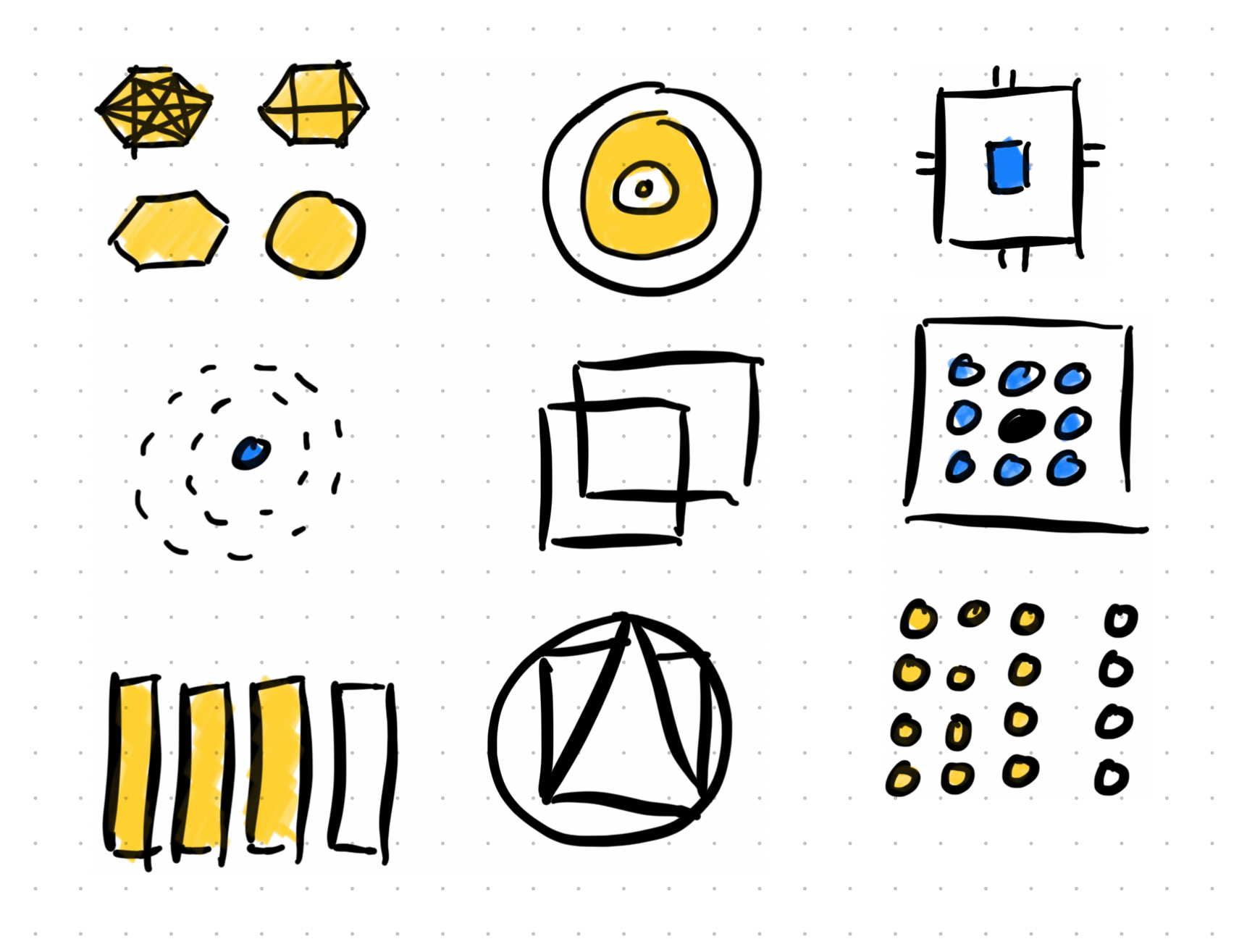
How It Helps: Humans are fickle and emotionally driven. It’s difficult for people to clearly articulate why they think and feel that they do. The Laws of UX are backed by the observational science over decades of research that guide your thinking to bridge the interplay between technology and humanity.
Example Scenario: Tom is in a sprint planning meeting discussing the search functionality redesign. The product leader wants to focus resources on "making search results more beautiful and engaging with better typography and layout."
Tom references his design research and thinks about how to explain what he’s seeing. He remembers one of the laws called the “Doherty Threshold”. He pipes up, "Beautiful results are helpful (especially visual hierarchy), but it won’t matter as much if users lose patience waiting for them. The Doherty Threshold shows us computer systems need to respond fast, specifically within 400 milliseconds to maintain the feeling of productivity without waiting. Right now our search results take an average of 1.2 seconds. Users are perceiving our search as slow and annoying."
"This isn't about our server capacity or technical limitations. It's about human time perception. Above 400ms, users lose confidence that our system is helping them be efficient. Delays become pain points. We're working against fundamental psychology."
The conversation has shifted from visual polish to performance optimization. Tom just helped move from an aesthetic discussion into a technical priority with measurable user impact.
The career impact: When you can cite documented and well-proven principles instead of feelings and preferences, people stop treating design like decoration. You become someone who makes evidence-based decisions, not someone who makes things "look nice."
3. Morville's Honeycomb: Your Value Compass
What it is: Over 20 years ago, Peter Morville (with the help of some friends) defined the key elements required for user experiences to be valuable to users. There are six facets of value to consider: useful, usable, findable, credible, desirable, and accessible. They fit together like a honeycomb, where these facets encircle the center creating “value.” That means value is experienced at the intersection of those six key facets. Miss one, and you might miss value altogether.
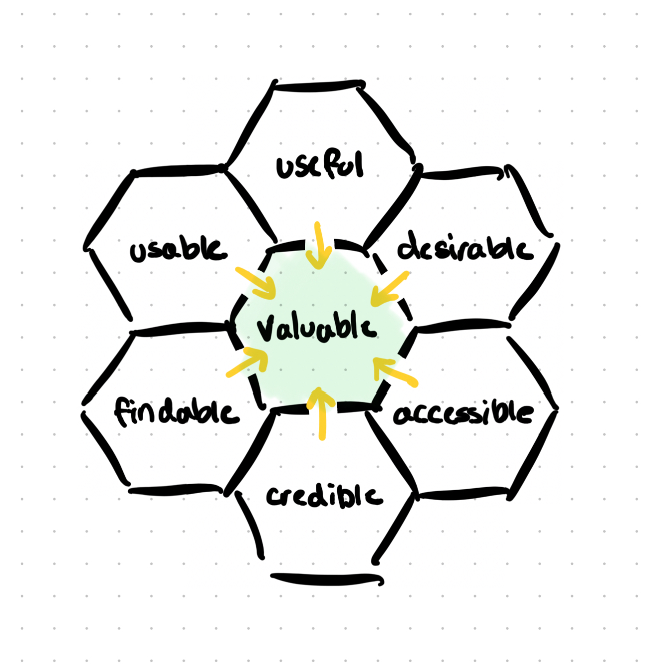
How It Helps: Stakeholders outside of UX love throwing around words like "engaging" and "delightful" without defining what they mean. This honeycomb gives you a concrete vocabulary and visual framework for discussing what makes experiences valuable which will result in engagement and delight. It also provides a clear diagnosis when you see something missing the mark.
Example Scenario: Jessica is in a feature planning meeting. A highly paid opinion keeps insisting that their new dashboard needs to be "more engaging" and "delightful like Apple” because they aren’t seeing high enough utilization stats. Product is trying to translate that into functional requirements. The engineering team is getting frustrated because they need a clear blueprint to build. UX can tell something’s missing.
Jessica realizes high engagement comes from deeply felt value: "Let's define what we mean by engaging. Looking at our users—enterprise account managers—what would make this experience valuable to them? Based on our research, they need it to show the right data (useful), fast to navigate through (usable), and accurate real-time information (credible). Delight for this audience looks different than consumer products where flashy animations or cute illustrations might bring a smile. For our users, delight means accomplishing their quarterly review in half the time."
She continues: "If we're inspired by Apple, what we should borrow is their ruthless focus on usefulness first. An iPhone is delightful because it does what you need every single time, not because it has extra animations. Animations only enhance the foundational usefulness.”
The conversation immediately becomes more productive. Instead of debating subjective concepts like "engagement," they're discussing measurable outcomes like task completion time, visual hierarchy, data accuracy, and UI load times.
The career impact: When you can turn buzz words into clearly defined value, you become a strategic thinker, not just a pixel pusher. You help teams make better decisions about where to invest their energy, helping the user win, and the business succeed.
4. OOUX: Your Complexity Solver
What it is: Object-Oriented UX (OOUX) by Sophia Prater treats digital experiences like systems of objects with attributes, relationships, and actions. It’s borrowed from an engineering philosophy called Object-Oriented Programming. The OOUX methodology helps organize complex information and interactions into clear, systematic structures that are built to last.

How It Helps: Most digital products start small and can get away with less structure. As they grow over time, they become frankenstein monsters with features bolted onto features with no underlying logic. OOUX gives you a systematic way to make sense of chaos and keep it organized.
Example Scenario: Kevin inherits a "simple" project: redesigning the company's client portal. But as he digs in, he discovers the portal includes project management tools, billing information, document storage, communication threads, team member management, and reporting dashboards. Previous designers have just kept adding screens whenever someone requested a new feature. Plus, pressure to ship quickly to market has kept teams from reorganizing or cleaning up disjointed flows.
Kevin could start reskinning interfaces immediately, but he senses the chaos in the app. After some initial thinking about the persona and a few user flows, he quickly maps out the prominent objects: Projects, Clients, Team Members, Documents, Messages, and Invoices. Then he starts identifying the relationships: Projects belong to Clients, Team Members can be assigned to multiple Projects, Documents are attached to both Projects.
Within a few hours of mapping, Kevin sees the underlying structure that's been growing beneath years of feature accumulation. The current portal is confusing because it treats screens as buckets of actions instead of recognizing that users are really managing relationships between objects.
When Kevin presents his analysis, the product team immediately understands why users get lost. More importantly, they can see a clear path forward that is based on rational, systematic information rather than aesthetic beauty.
The career impact: When you can bring systems thinking to complex problems, you become the person teams trust with their hardest challenges. You're not just designing screens or flows. You're designing systems. And systems with solid structures are inherently more usable and efficient.
5. Business Model Canvas: Your Strategic Translator
What it is: A framework from Strategyzer that maps how businesses create, deliver, and capture value. It connects customer needs, value propositions, channels, revenue streams, and cost structures.
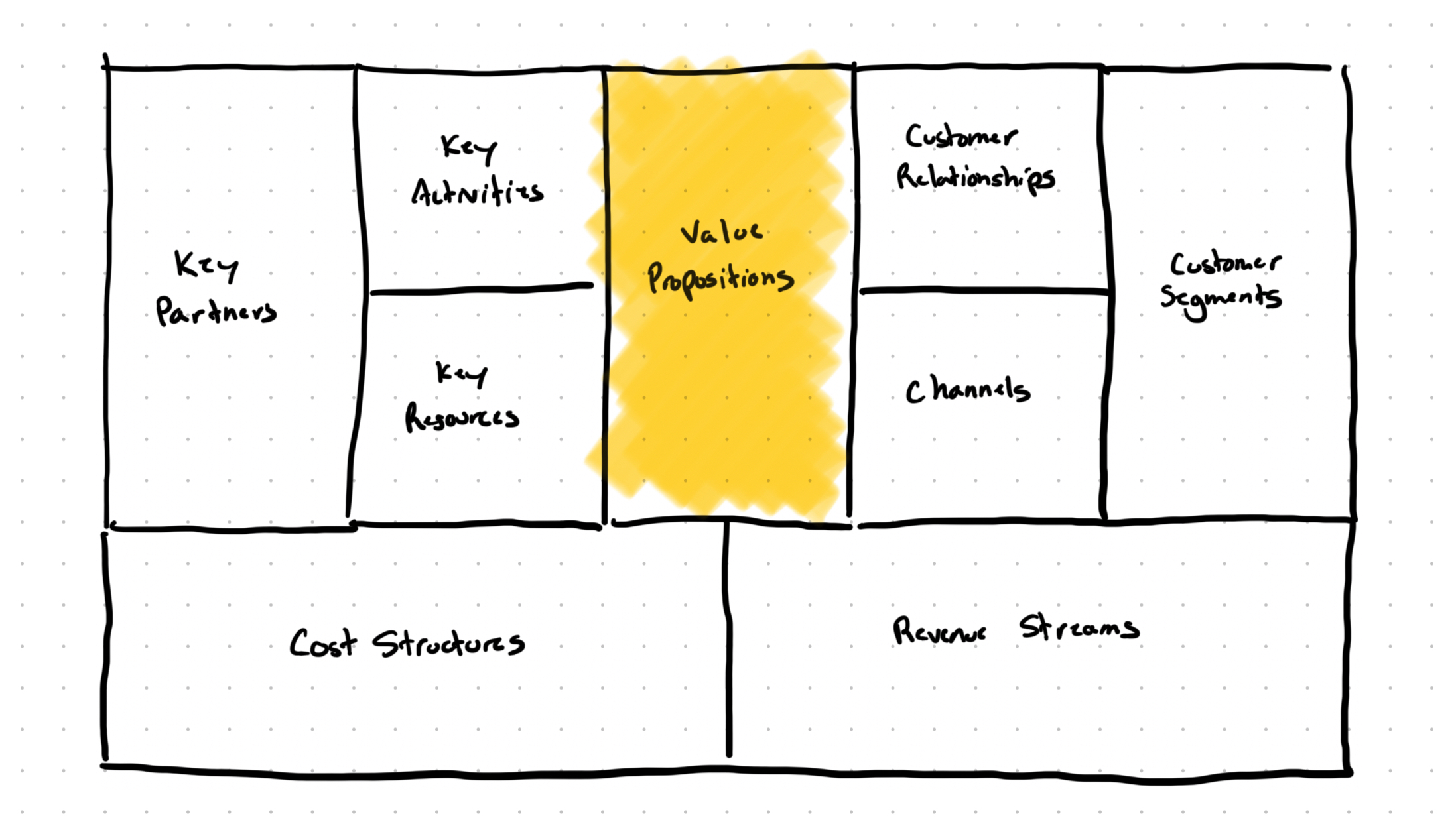
How it helps: Design lives between profitable business and the value it provides to users. If you ignore the business, you drive up costs, reduce revenue, and hurt the ability to help the user. When you understand how your company makes money, you can focus your design work on the most valuable things.
Example scenario: Lisa has been pushing for a more streamlined onboarding flow for months, but it keeps getting deprioritized. They keep saying it doesn’t align with our current product strategy.
Instead of arguing about user experience principles or the latest trends or user empathy, Lisa maps out the business model. She identifies that their SaaS company's biggest challenge isn't acquiring new customers. It's reducing churn in the first 90 days. She discovers that 40% of new signups never complete the initial setup process. 40%!
Lisa returns to her leadership with a different pitch: "Our current onboarding flow is costing us approximately $450,000 in lost annual recurring revenue. Users who don't complete setup cancel their subscription in 30 days. If we can increase setup completion by 25%, we're looking at $62,500 in additional ARR just from existing signups. I’ve mapped out a few key changes that will only cost us around $30,000, so in the first year we’ll improve our profit and gain it year over year.”
Suddenly her suggestion to improve onboarding isn't just a "nice user experience improvement." It's a revenue optimization project that gets prioritized immediately.
The career impact: When you can connect design work to business outcomes, you become a strategic partner instead of a creative service provider. Your work gets prioritized because people understand the value it brings.
Bonus: The Laws of Simplicity
Here's one more I thought I'd throw in: John Maeda's principles for reducing complexity—“Simplicity is about subtracting the obvious and adding the meaningful."
All the frameworks above give you analytical power, but Maeda gives you synthesis power. It’s the ability to withhold “yes” for only the most important elements. It’s easy to let complexity creep in. It needs to be managed over time. Simplicity is what keeps your products useful.
The best designers don't just diagnose problems and cite principles. They synthesize (reduce down) insights into solutions that feel effortless. Complexity is easy. Simplicity requires mastery.
Your Complete Professional EDC
Like any good EDC, this isn't about carrying every framework you've ever heard of. It's about the few that have proven themselves indispensable time and time again. These frameworks have earned their place in my professional toolkit by helping me solve complex problems over and over again. They've helped me explain my thinking and work to others so they can challenge, sharpen, and align with what my teams and I have discovered.
The benefit is that you stop getting surprised by stakeholder pushback. You start having productive conversations about trade-offs instead of arguments about preferences (more specifically your preferences). You become someone who influences product strategy instead of someone who merely executes other people's ideas.
Most importantly, you stop feeling like an imposter when non-designers question your work. You have answers. Real answers backed by frameworks that have proven themselves across thousands of projects and hundreds of companies.
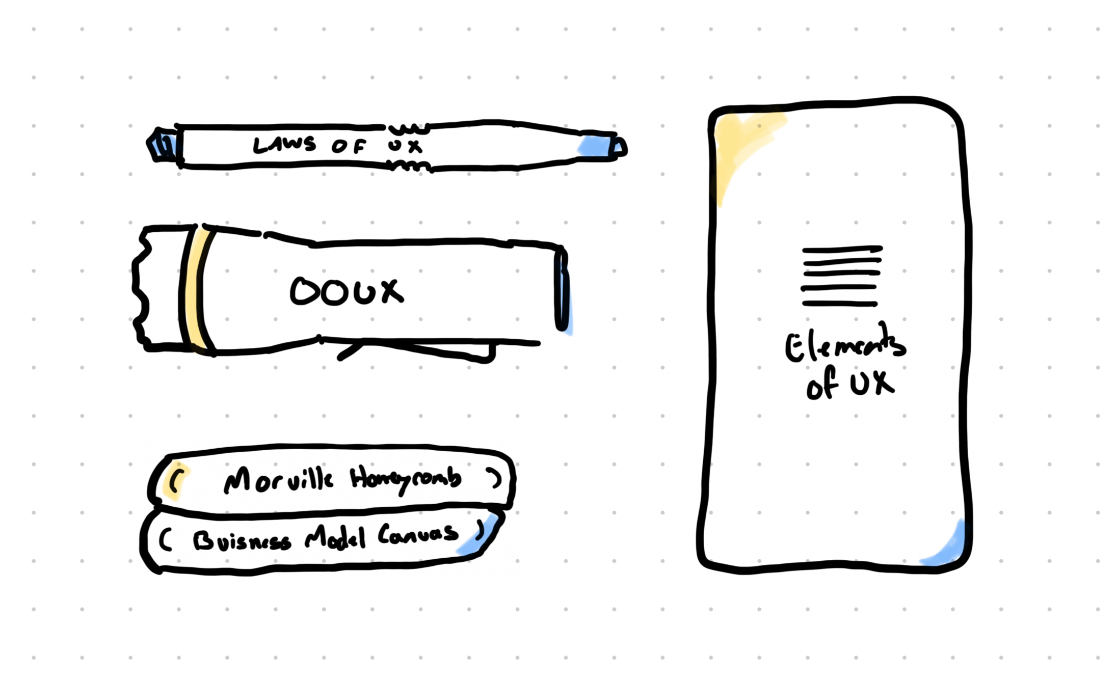
One of my favorite parts is that these frameworks all complement each other, making them a useful collection to keep together:
- Elements of UX → Problem diagnosis
- Laws of UX → Evidence-based decisions
- Morville's Honeycomb → Value definition
- OOUX → Structural organization
- Business Model Canvas → Strategic alignment
- Laws of Simplicity → Complexity management
Getting good at using these five frameworks will take you from pixel-pusher to strategic partner, from order-taker to problem-solver, from creative resource to essential team member.
The question isn't whether you need to carry these frameworks every day. The question is: how much longer can your career afford to go without them? Especially in an age where AI can replicate solutions but not the strategic thinking that makes them best for your context.
Pick one framework from this list and use it to prepare for your next stakeholder meeting. Then, come back and let me know how the conversation changes.